Joel Klein is also utterly shameless.
Parent advocate Leonie Haimson called him "an educational Bernie Madoff" at the end of tenure in NYC. His greatest scheme was convincing New York's voters that he had worked miracles while leading the schools in NYC; it's clear he did not. Klein was happy to keep pointing at rising state test scores as proof of his success, but those scores turned out to be an illusion. On national test scores, Klein's NYC did no better - and, to be fair, really no worse - than other major US cities.
That, of course, never stopped Klein from tooting his own horn. He's now taken this unbridled enthusiasm for his own apparent genius into the private sector: this week, he made a big pitch to investors to get in on the ground floor of his new company by both touting his own successes and vilifying the rest of the education system:
Klein’s point is that U.S. K-12 education is a “broken model,” with shockingly low graduation rates, “we spend a lot on education and do not see the results.” To change all this, Klein said, “the private sector’ has to be involved and that “technology will forever change how we teach students.” Klein said, “kids use media and technology of all kinds but they’re told they have to turn them all off when they get to school.” [emphasis mine]Folks, what you are about to see is worthy of a master grifter plying his craft on easy marks. Ready?
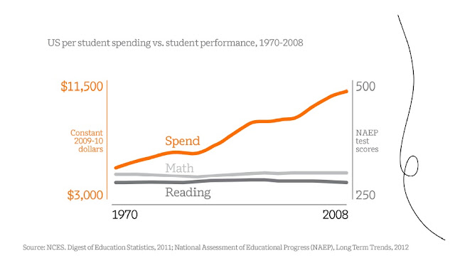
To drive the failure and high cost of America's schools home, the Amplify investor presentation includes the following chart.
OMG!!! This is outrageous! Look at all that money we're spending! And look at those flat test scores! American education is a disaster! Get out your checkbooks, American investors! We need Joel Klein's tablets, and we need them NOW!
Except...
Except Joel Klein just told us how great he did in New York City - and he wasn't using a bunch of digital junk when he was the chancellor. Hmm...
Not only that; the graph above uses two separate, completely unrelated y-axes on either side. That doesn't seem right, does it? I mean, is it really fair to say a gain on the NAEP from 250 to 500 is equivalent to a spending gain from $3,000 to $11,500? Maybe there's another way to look at this...
Which is just what I did. Using the same sources as Klein's presentation, here is the same data* presented in a different graph:
Wow, look at this! Math gains have shot up while spending has remained basically flat! And even reading gains have outpaced spending gains! Our schools are doing great with just a small increase in costs! Maybe we don't need Joel's tablets after all...
Obviously, all I did was change the scales of the y-axes. And the beauty of this is that my graph is no more deceptive than Klein's. Or maybe it's better to say it's no less deceptive: both graphs make the mistake of assuming gains in spending can be accurately compared to gains in tests scores. They can't - and anyone who tries to conflate spending with test score gains is selling you snake oil.
Let me put it another way: Klein once bragged on an 11-point gain in NYC's 4th grade reading scores. If that's so great, why isn't he happy with the 12-point gain in those scores across the nation? Why set up a graph that shows this is a lack of "results" when he bragged about a smaller gain in his own city?
I'll tell you why: Joel Klein touts failure or success as it suits his own purposes. He shouts "Success!" when he needs to sell his own past; he screams "Failure!" when he needs to sell his company to investors.
This twisting of statistics is utterly shameless. Anyone who is thinking about whether or not to sink money into this venture needs to ask themselves if they want to do business with a man who plays as fast and loose with the facts as Joel Klein.
* To be clear: I'm not sure what "NAEP test scores" refers to exactly in Klein's graph. The National Assessment of Education Progress tests at the ages of 9, 13, and 17 in math and reading. I don't know if they averaged the three out or what. I just averaged the 9 year-old and 13 year-old scores for each test.
It really doesn't matter: the point I'm trying to make is that it is utterly useless to set up a graph this way. Bruce Baker has the definitive post about how deceptive the entire practice is.


2 comments:
Joel Klein's graph is so moronic and ahistorical that it boggles the mind. I wonder if he realizes that we didn't start including students with disabilities, ELLs, at risk youth, and other more expensive students until around the mid 70's.
Recall Richard Rothstein's take down of Klein’s autobiography. He said Klein's entire autobiography is a sleight of hand.
http://prospect.org/article/joel-kleins-misleading-autobiography
Pants on fire...
Post a Comment